チュートリアル
簡単にライブラリーを使用するためのチュートリアルコレクション
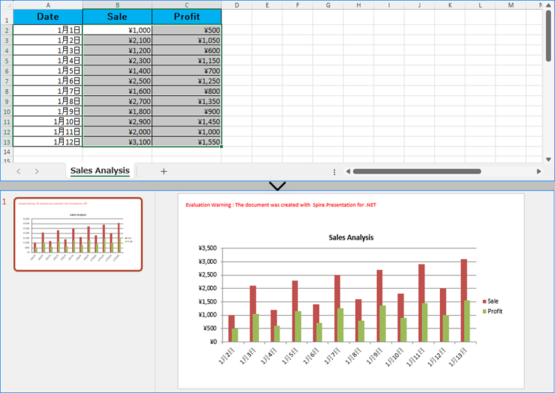
PowerPoint スライドにグラフを作成することは、複雑な情報を視覚的に表現し、聴衆が重要な洞察を理解しやすくするための強力な方法です。Excel データを直接読み取ってグラフを生成することで、データ入力プロセスを効率化し、データの正確性を確保できます。また、Excel ファイルからのチャートを PowerPoint プレゼンテーションに直接画像として挿入することで、元の書式や外観を最大限に活かすことも可能です。本記事では、.NET プログラム内で Spire.Office for .NET を使用して、Excel データから PowerPoint スライドにグラフを作成する方法をご紹介します。
まず、Spire.Office for .NET パッケージに含まれている DLL ファイルを .NET プロジェクトの参照として追加する必要があります。DLL ファイルは、このリンクからダウンロードするか、NuGet を介してインストールできます。
PM> Install-Package Spire.Office開発者は、Spire.XLS for .NET を使用して Excel ワークシートからデータを読み取り、そのデータをグラフのデータソースとして使用して、Spire.Presentation for .NET で PowerPoint スライドにグラフを作成することができます。Excel ファイルのデータを使用して PowerPoint プレゼンテーションにグラフを作成するための詳細な手順は以下のとおりです:
using Spire.Presentation;
using Spire.Presentation.Charts;
using Spire.Xls;
using System.Drawing;
using FileFormat = Spire.Presentation.FileFormat;
using IChart = Spire.Presentation.Charts.IChart;

namespace PresentationChartExcelData
{
    class Program
    {
        public static void Main(string[] args)
        {
            // Presentationクラスのインスタンスを作成
            Presentation presentation = new Presentation();

            // スライドサイズを設定
            presentation.SlideSize.Type = SlideSizeType.Screen16x9;

            // Workbookクラスのインスタンスを作成し、Excelファイルを読み込む
            Workbook workbook = new Workbook();
            workbook.LoadFromFile("Sample.xlsx");

            // Workbook内の最初のワークシートを取得
            Worksheet sheet = workbook.Worksheets[0];

            // プレゼンテーションにチャートを作成
            RectangleF rect = new RectangleF(50, 100, presentation.SlideSize.Size.Width - 100, presentation.SlideSize.Size.Height - 150);
            ISlide slide = presentation.Slides[0];
            IChart chart = slide.Shapes.AppendChart(ChartType.ColumnClustered, rect);

            // デフォルトのダミーデータをクリア
            chart.ChartData.Clear(0, 0, 5, 5);

            // ワークシート内の行を繰り返し処理
            for (int i = 0; i < sheet.AllocatedRange.RowCount; i++)
            {
                // ワークシート内の列を繰り返し処理
                for (int j = 0; j < sheet.AllocatedRange.ColumnCount; j++)
                {
                    // ワークシートのセル値をチャートデータの値として設定
                    chart.ChartData[i, j].Value = sheet.AllocatedRange[i + 1, j + 1].Value2;
                    // 数値形式をコピー
                    chart.ChartData[i, j].NumberFormat = sheet.AllocatedRange[i + 1, j + 1].NumberFormat;
                }
            }

            // チャートタイトルを設定
            chart.ChartTitle.TextProperties.Text = sheet.Name;
            chart.ChartTitle.TextProperties.IsCentered = true;
            chart.ChartTitle.Height = 25;
            chart.HasTitle = true;

            // シリーズラベルとカテゴリラベルを設定
            chart.Series.SeriesLabel = chart.ChartData["B1", "C1"];
            chart.Categories.CategoryLabels = chart.ChartData["A2", "A" + sheet.AllocatedRange.RowCount];

            // シリーズ値を設定
            chart.Series[0].Values = chart.ChartData["B2", "B" + sheet.AllocatedRange.RowCount];
            chart.Series[1].Values = chart.ChartData["C2", "C" + sheet.AllocatedRange.RowCount];

            // 軸の数値形式を設定
            chart.PrimaryCategoryAxis.NumberFormat = sheet.AllocatedRange["A2"].NumberFormat;
            chart.PrimaryValueAxis.NumberFormat = sheet.AllocatedRange["B2"].NumberFormat;

            // チャートのスタイルを設定
            chart.ChartStyle = ChartStyle.Style2;

            // オーバーラップとギャップ幅を設定
            chart.OverLap = 50;
            chart.GapWidth = 200;

            // プレゼンテーションを保存
            presentation.SaveToFile("output/ExcelデータからPowerPointグラフを作成.pptx", FileFormat.Pptx2019);
            presentation.Dispose();
            workbook.Dispose();
        }
    }
}
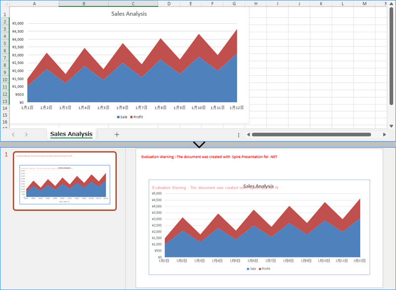
Excel ワークシートの既存のグラフをその外観と書式を正確に維持しながら PowerPoint スライドに挿入するためには、Workbook.SaveChartAsImage() メソッドを使用します。このメソッドは、Excel グラフを画像として保存し、その画像をスライドに追加することができます。具体的な手順は以下のとおりです:
using Spire.Presentation;
using Spire.Presentation.Drawing;
using Spire.Xls;
using System.Drawing;
using FileFormat = Spire.Presentation.FileFormat;

namespace PresentationChartExcelChart
{
    class Program
    {
        public static void Main(string[] args)
        {
            // Presentationクラスのインスタンスを作成
            Presentation presentation = new Presentation();

            // スライドサイズを設定
            presentation.SlideSize.Type = SlideSizeType.Screen16x9;

            // Workbookクラスのインスタンスを作成し、Excelファイルを読み込む
            Workbook workbook = new Workbook();
            workbook.LoadFromFile("Sample.xlsx");

            // 最初のワークシート内の最初のチャートを画像として保存
            Image image = workbook.SaveChartAsImage(workbook.Worksheets[0], 0);

            // 画像をプレゼンテーションに埋め込む
            IImageData imageData = presentation.Images.Append(image);

            // 最初のスライドに画像を追加
            RectangleF rect = new RectangleF(50, 120, presentation.SlideSize.Size.Width - 100, presentation.SlideSize.Size.Height - 170);
            presentation.Slides[0].Shapes.AppendEmbedImage(ShapeType.Rectangle, imageData, rect);

            // プレゼンテーションを保存
            presentation.SaveToFile("output/PowerPointでExcelのグラフを画像として挿入.pptx", FileFormat.Pptx2019);
            presentation.Dispose();
            workbook.Dispose();
        }
    }
}
結果ドキュメントから評価メッセージを削除したい場合、または機能制限を取り除く場合は、についてこのメールアドレスはスパムボットから保護されています。閲覧するにはJavaScriptを有効にする必要があります。にお問い合わせ、30 日間有効な一時ライセンスを取得してください。
PowerPoint で、組み合わせグラフは2つ以上の異なるグラフタイプを1つのグラフに組み合わせるグラフです。これにより、複数のデータセットを同じグラフに表示することができ、異なる変数を比較・分析することが容易になります。この記事では、Spire.Presentation for .NET を使用してPowerPoint プレゼンテーションで組み合わせグラフを作成する方法を示します。
まず、Spire.Presentation for .NET パッケージに含まれている DLL ファイルを .NET プロジェクトの参照として追加する必要があります。DLL ファイルは、このリンクからダウンロードするか、NuGet を介してインストールできます。
PM> Install-Package Spire.PresentationSpire.Presentation for .NET では、ISlide.Shapes.AppendChart(ChartType type, RectangleF rectangle) メソッドを使用して、特定のグラフタイプをスライドに追加することができます。そして、2番目のシリーズのグラフタイプを別のグラフに変更して組み合わせグラフを作成することができます。以下は PowerPoint で縦棒グラフと折れ線グラフを組み合わせる手順です。
using Spire.Presentation;
using Spire.Presentation.Charts;
using Spire.Presentation.Drawing;
using System;
using System.Data;
using System.Drawing;

namespace CombinationChart
{
    class Program
    {
        static void Main(string[] args)
        {
            //Presentationインスタンスを作成する
            Presentation presentation = new Presentation();

            //最初のスライドに縱棒グラフを追加する
            RectangleF rect = new RectangleF(80, 120, 550, 320);
            IChart chart = presentation.Slides[0].Shapes.AppendChart(ChartType.ColumnClustered, rect);

            //グラフのタイトルを設定して書式設定する
            chart.ChartTitle.TextProperties.Text = "月次売上レポート";
            chart.ChartTitle.TextProperties.IsCentered = true;
            chart.ChartTitle.Height = 30;
            chart.HasTitle = true;

            //DataTableオブジェクトを作成してデータを追加する
            DataTable dataTable = new DataTable();
            dataTable.Columns.Add(new DataColumn("月", Type.GetType("System.String")));
            dataTable.Columns.Add(new DataColumn("売上", Type.GetType("System.Int32")));
            dataTable.Columns.Add(new DataColumn("成長率", Type.GetType("System.Decimal")));
            dataTable.Rows.Add("1月", 200, 0.6);
            dataTable.Rows.Add("2月", 250, 0.8);
            dataTable.Rows.Add("3 月", 300, 0.6);
            dataTable.Rows.Add("4 月", 150, 0.2);
            dataTable.Rows.Add("5 月", 200, 0.5);
            dataTable.Rows.Add("6月", 400, 0.9);

            //データテーブルからグラフデータにデータをインポートする
            for (int c = 0; c < dataTable.Columns.Count; c++)
            {
                chart.ChartData[0, c].Text = dataTable.Columns[c].Caption;
            }
            for (int r = 0; r < dataTable.Rows.Count; r++)
            {
                object[] datas = dataTable.Rows[r].ItemArray;
                for (int c = 0; c < datas.Length; c++)
                {
                    chart.ChartData[r + 1, c].Value = datas[c];

                }
            }

            //シリーズのラベルを設定する
            chart.Series.SeriesLabel = chart.ChartData["B1", "C1"];

            //カテゴリのラベルを設定する
            chart.Categories.CategoryLabels = chart.ChartData["A2", "A7"];

            //データをシリーズ値に割り当てる
            chart.Series[0].Values = chart.ChartData["B2", "B7"];
            chart.Series[1].Values = chart.ChartData["C2", "C7"];

            //シリーズ2のグラフタイプをデータマーカー付きの折れ線グラフに変更する
            chart.Series[1].Type = ChartType.LineMarkers;

            //シリーズ2のデータを副次値軸に描く
            chart.Series[1].UseSecondAxis = true;

            //副次値軸の数値書式を設定する
            chart.SecondaryValueAxis.NumberFormat = "0%";

            //副次値軸のグリッド線を非表示にする
            chart.SecondaryValueAxis.MajorGridTextLines.FillType = FillFormatType.None;

            //凡例の位置を設定する
            chart.ChartLegend.Position = ChartLegendPositionType.Top;

            //オーバーラップを設定する
            chart.OverLap = -50;

            //ギャップ幅を設定する
            chart.GapWidth = 200;

            //結果のドキュメントを保存する
            presentation.SaveToFile("CombinationChart.pptx", FileFormat.Pptx2010);
        }
    }
}
Imports Spire.Presentation
Imports Spire.Presentation.Charts
Imports Spire.Presentation.Drawing
Imports System
Imports System.Data
Imports System.Drawing
Namespace CombinationChart
Class Program
Private Shared Sub Main(ByVal args() As String)
'Presentationインスタンスを作成する
Dim presentation As Presentation = New Presentation
'最初のスライドに集合縱棒グラフを追加する
Dim rect As RectangleF = New RectangleF(80, 120, 550, 320)
Dim chart As IChart = presentation.Slides(0).Shapes.AppendChart(ChartType.ColumnClustered, rect)
'グラフのタイトルを設定して書式設定する
chart.ChartTitle.TextProperties.Text = "月次売上レポート"
chart.ChartTitle.TextProperties.IsCentered = True
chart.ChartTitle.Height = 30
chart.HasTitle = True
'DataTableオブジェクトを作成してデータを追加する
Dim dataTable As DataTable = New DataTable
dataTable.Columns.Add(New DataColumn("月", Type.GetType("System.String")))
dataTable.Columns.Add(New DataColumn("売上", Type.GetType("System.Int32")))
dataTable.Columns.Add(New DataColumn("成長率", Type.GetType("System.Decimal")))
dataTable.Rows.Add("1月", 200, 0.6)
dataTable.Rows.Add("2月", 250, 0.8)
dataTable.Rows.Add("3 月", 300, 0.6)
dataTable.Rows.Add("4 月", 150, 0.2)
dataTable.Rows.Add("5 月", 200, 0.5)
dataTable.Rows.Add("6月", 400, 0.9)
'データテーブルからグラフデータにデータをインポートする
Dim c As Integer = 0
Do While (c < dataTable.Columns.Count)
chart.ChartData(0, c).Text = dataTable.Columns(c).Caption
c = (c + 1)
Loop
Dim r As Integer = 0
Do While (r < dataTable.Rows.Count)
Dim datas() As Object = dataTable.Rows(r).ItemArray
Dim c As Integer = 0
Do While (c < datas.Length)
chart.ChartData((r + 1), c).Value = datas(c)
c = (c + 1)
Loop
r = (r + 1)
Loop
'シリーズのラベルを設定する
chart.Series.SeriesLabel = chart.ChartData("B1", "C1")
'カテゴリのラベルを設定する
chart.Categories.CategoryLabels = chart.ChartData("A2", "A7")
'データをシリーズ値に割り当てる
chart.Series(0).Values = chart.ChartData("B2", "B7")
chart.Series(1).Values = chart.ChartData("C2", "C7")
'シリーズ2のグラフタイプをデータマーカー付きの折れ線グラフに変更する
chart.Series(1).Type = ChartType.LineMarkers
'シリーズ2のデータを副次値軸に描く
chart.Series(1).UseSecondAxis = True
'副次値軸の数値書式を設定する
chart.SecondaryValueAxis.NumberFormat = "0%"
'副次値軸のグリッド線を非表示にする
chart.SecondaryValueAxis.MajorGridTextLines.FillType = FillFormatType.None
'凡例の位置を設定する
chart.ChartLegend.Position = ChartLegendPositionType.Top
'オーバーラップを設定する
chart.OverLap = -50
'ギャップ幅を設定する
chart.GapWidth = 200
'結果のドキュメントを保存する
presentation.SaveToFile("CombinationChart.pptx", FileFormat.Pptx2010)
End Sub
End Class
End Namespace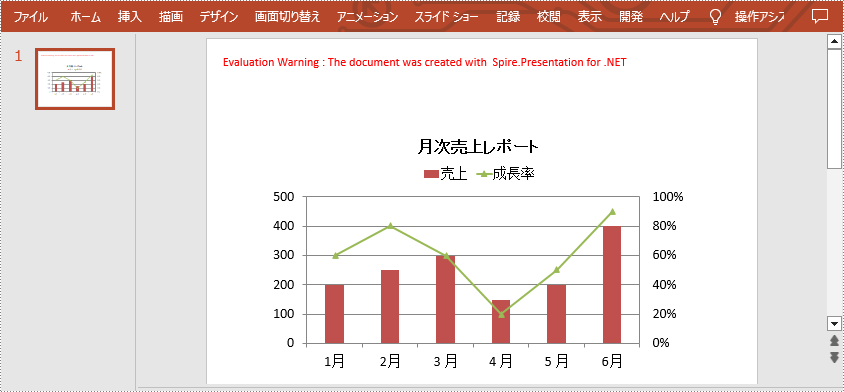
結果ドキュメントから評価メッセージを削除したい場合、または機能制限を取り除く場合は、についてこのメールアドレスはスパムボットから保護されています。閲覧するにはJavaScriptを有効にする必要があります。にお問い合わせ、30 日間有効な一時ライセンスを取得してください。